PROJECT OVERVIEW
The Problem:
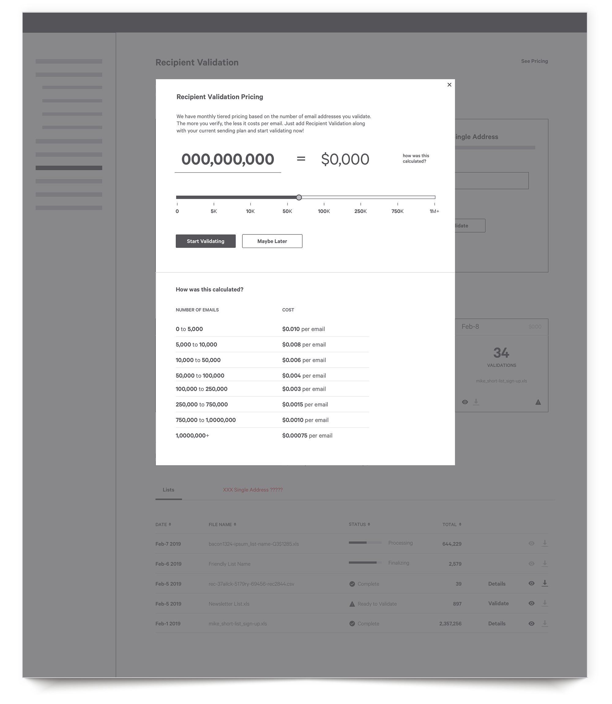
The goal of an email campaign is to generate leads and ultimately revenue. However, this can’t happen unless emails actually reach the inbox. By sending to addresses with typos or to invalid users, a company’s reputation becomes damaged and ISPs like Gmail will block them. SparkPost’s Recipient Validation is a service that checks the validity of email addresses and returns a clean list to send with.
My Role:
Lead UX Designer (reasearch, wire framing, visual design, prototyping, user testing)
RESEARCH AND DISCOVERY
Competitive Analysis: DO A TABLE
I began my research and discovery by exploring the existing players in this space. I did an analysis by visiting their sites, signing up for the services, and going through the validation process. I also spoke with some of our current customers who have used a number of other services to get their insights.
While there are a number of competitors in this space, I have briefly summarized my findings for our top two, Kickbox and BriteVerify.
Personas:
Poor sender reputation is a known issue in the email delivery space, and it touches just about every user involved in the process. That said, I wanted to know more about which users are directly experiencing the pains caused by this issue.
I wanted to speak to our customer success team and technical account managers who interact with our customers daily. After sitting down with them, it was clear that users who are responsible for customer lists and new user sign ups are ultimately on the line when things go wrong. Therefore, they are typically the ones who require and use validation services.
My Approach
User and Client Needs
Before I do any mapping or sketching, I like to put myself in the eye of the user so I can really think about what their raw needs and experiences are. What is going on in their heads? What are their frustrations and successes? I then follow the same process from the point of view of the business and its key stakeholders. Only when I look at these together can I then move on to the next step.
Information Architecture and User Flows
Bacon ipsum dolor amet brisket t-bone sausage tongue. Ham bresaola pastrami shoulder capicola meatloaf leberkas andouille ham hock burgdoggen pork. Ball tip pork chop turkey shoulder shank strip steak corned beef cupim spare ribs pork loin short loin kevin jerky.
Wireframes
I began to map out the flows into wireframes. After preliminary user testing, feedback, home page, etc.